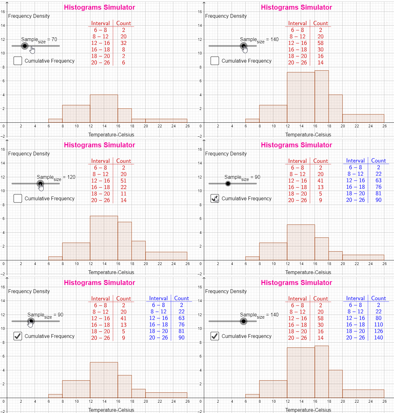
A histogram represents continuous grouped data as a running total in each group.
The area of a each bar, as opposed to the height of each bar, represents the frequency of each group or bar.
The greater the area, the greater the frequency.
Since classes are not of equal width, as this is the case in a bar chart,
the y-axis represents the frequency density, instead of frequency of a given set of data.
frequency density = frequency / class width
You can practise histograms with the following applet:


0 comments:
Post a Comment